Telecom Rebrand & Website
A bold revival to a local legacy telecommunications brand.
Telecom Rebrand
A bold revival to a local legacy telecommunications brand.
Telecom Rebrand
A bold revival to a local legacy telecommunications brand.
Telecom Rebrand
A bold revival to a local legacy telecommunications brand.
Telecom Rebrand
A bold revival to a local legacy telecommunications brand.
CLIENT
RTC
ROLE
Visual Designer
UI Designer
Copywriter
RESPONSIBILITIES
Research
Ideation
Concept Creation
Logo Design
Business Collateral Design
Website Design
CLIENT
RTC
ROLE
Visual Designer
UI Designer
Copywriter
RESPONSIBILITIES
Research
Ideation
Concept Creation
Logo Design
Business Collateral Design
Website Design
The Client
RTC (Reserve Telecommunications) is a small telecommunications company that has served a local region of South Louisiana since 1935.
The Problem
Though it was once the service provider of choice for the region, Reserve Telecommunications found itself in a rut. Bigger names in telecom had begun taking more and more marketshare while they found their brand slowly disintegrating through inconsistent messaging and an outdated visual identity. Their logo had been “frankensteined” over the years through adding clipart-style icons to it as new services were introduced, and it had come to look dated against the slick marketing campaigns by their competitors.
The Client
RTC (Reserve Telecommunications) is a small telecommunications company that has served a local region of South Louisiana since 1935.
The Problem
Though once the service provider of choice for the region, Reserve Telecommunications found itself in a rut. Bigger names in telecom had begun taking more and more marketshare while they found their brand slowly disintegrating through inconsistent messaging and an outdated visual identity. Their logo had been “frankensteined” over the years through adding clipart-style icons to it as new services were introduced, and it had become dated against the slick marketing campaigns by their competitors.


The Project
The brand overhaul project would consist of a new logo design, an expanded visual branding system, a corporate identity style guide, and a brand new website that would serve as the destination of all new marketing collateral going forward.
Goals
Tired of appearing disjointed, the client wanted their new brand to be a robust representation of what the company was capable of. The main goal was to be perceived as a modern, high-tech telecom company with a bold and recognizable visual brand.
Target Audience
The target audience was focused on the client’s service areas in southeast Louisiana and included:
- Lower to middle class residents
- Small business owners
- Whites and African-Americans
- Younger customers interested in the latest technology
- Older customers wanting excellent personal service
Research Findings
To do the rebrand justice, I had to get to the essence of the company. I learned that not only did the client have a long local history (they opened in 1935!), but their service and equipment offerings are top-notch and have debuted new technologies before their competitors on more than one occasion. What really sets them apart, however, is their dedication to their people: both employees and customers. They will go out of their way to help, and go above and beyond what any other telecom company would do. Plus, being locally owned and operated in the communities they serve gives them an edge in connecting with their customers’ unique culture.
Initial Sketches
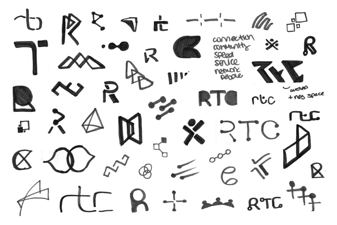
I wanted to present the client with a variety of approaches to review: typographic, geometric, abstract, and symbolic. Below is a sample of my initial sketches.
Initial Sketches
I wanted to present the client with a variety of approaches to review: typographic, geometric, abstract, and symbolic. Below is a sample of my initial sketches.
Initial Sketches
I wanted to present the client with a variety of approaches to review: typographic, geometric, abstract, and symbolic. Below is a sample of my initial sketches.
Concept Exploration
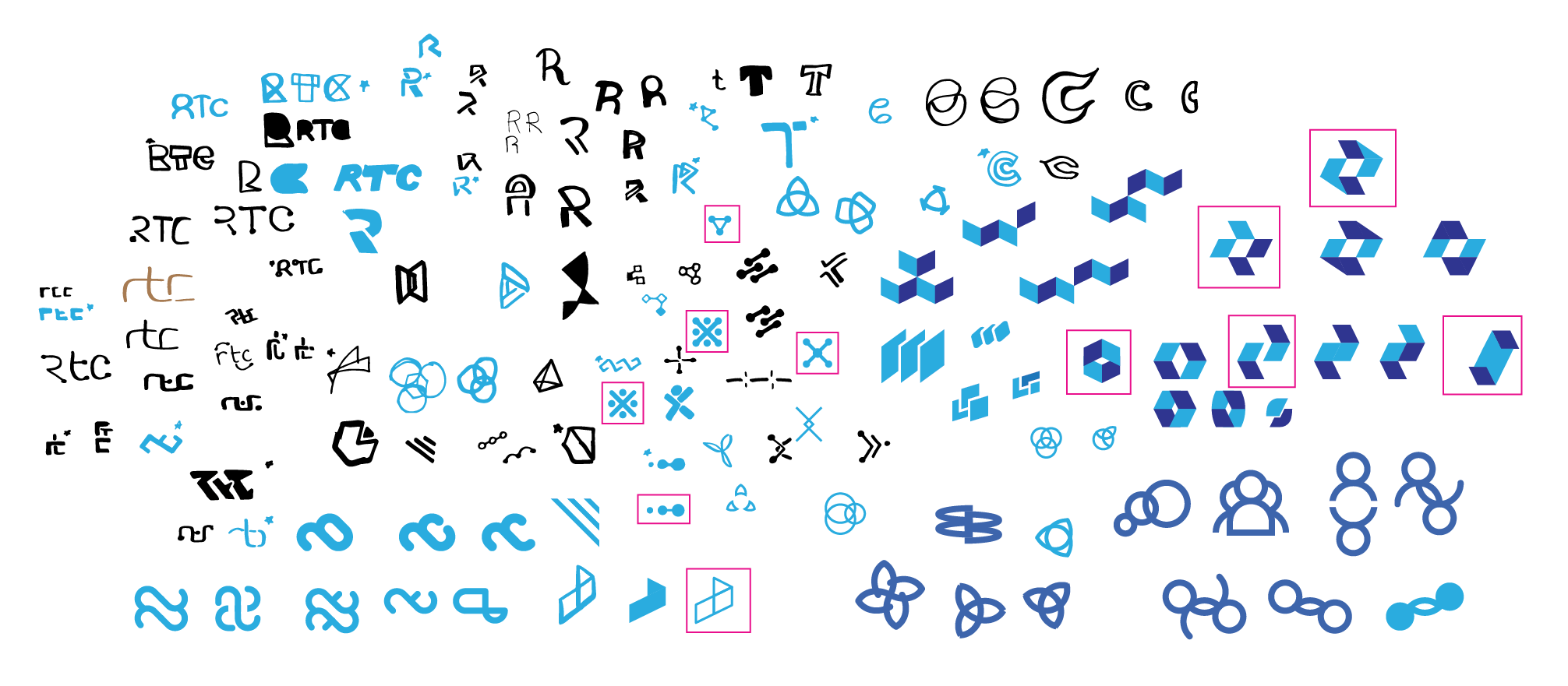
After scanning all of my sketches into Illustrator, I pulled out the strongest concepts and started manipulating the shapes into multiple variations to see where I could take them further. Below is a sample of my digitized sketches and shapes that were starting to form.
Concept Exploration
After scanning all of my sketches into Illustrator, I pulled out the strongest concepts and started manipulating the shapes into multiple variations to see where I could take them further. Below is a sample of my digitized sketches and shapes that were starting to form.
Concept Exploration
After scanning all of my sketches into Illustrator, I pulled out the strongest concepts and started manipulating the shapes into multiple variations to see where I could take them further. Below is a sample of my digitized sketches and shapes that were starting to form.
Concept Exploration
After scanning all of my sketches into Illustrator, I pulled out the strongest concepts and started manipulating the shapes into multiple variations to see whee I could take them further. Below is a sample of my digitized sketches and shapes that were starting to form.
Color Study
Color is my favorite aspect of visual design. For this project, I knew I wanted a color palette that would be bright, high-contrast, and stand out amongst their competitors. Below is a sample of palettes I explored.
Color Study
Color is my favorite aspect of visual design. For this project, I knew I wanted a color palette that would be bright, high-contrast, and stand out amongst their competitors. Below is a sample of palettes I explored.
Color Study
Color is my favorite aspect of visual design. For this project, I knew I wanted a color palette that would be bright, high-contrast, and stand out amongst their competitors. Below is a sample of palettes I explored.

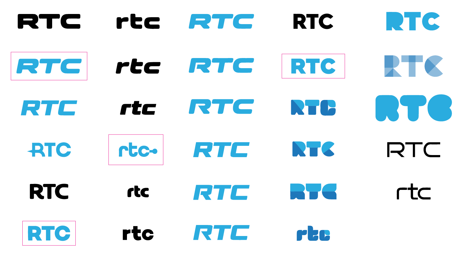
Type Study
I knew I wanted to present at least one typographic version with a bold, heavy weight (After all, I only had 3 letters to work with!). I pulled samples of type and studied how the letterforms worked together within each font.
Type Study
I knew I wanted to present at least one typographic version with a bold, heavy weight (After all, I only had 3 letters to work with!). I pulled samples of type and studied how the letterforms worked together within each font.
Type Study
I knew I wanted to present at least one typographic version with a bold, heavy weight (After all, I only had 3 letters to work with!). I pulled samples of type and studied how the letterforms worked together within each font.
Final Logo Concepts
I presented these logo concepts to the client while going over the idea behind and future vision for each one. Ultimately, the client chose the concept on the top right, but requested to see some different color options before giving final approval.
Final Logo Concepts
I presented these logo concepts to the client while going over the idea behind and future vision for each one. Ultimately, the client chose the concept on the top right, but requested to see some different color options before giving final approval.
Final Logo Concepts
I presented these logo concepts to the client while going over the idea behind and future vision for each one. Ultimately, the client chose the concept on the top right, but requested to see some different color options before giving final approval.
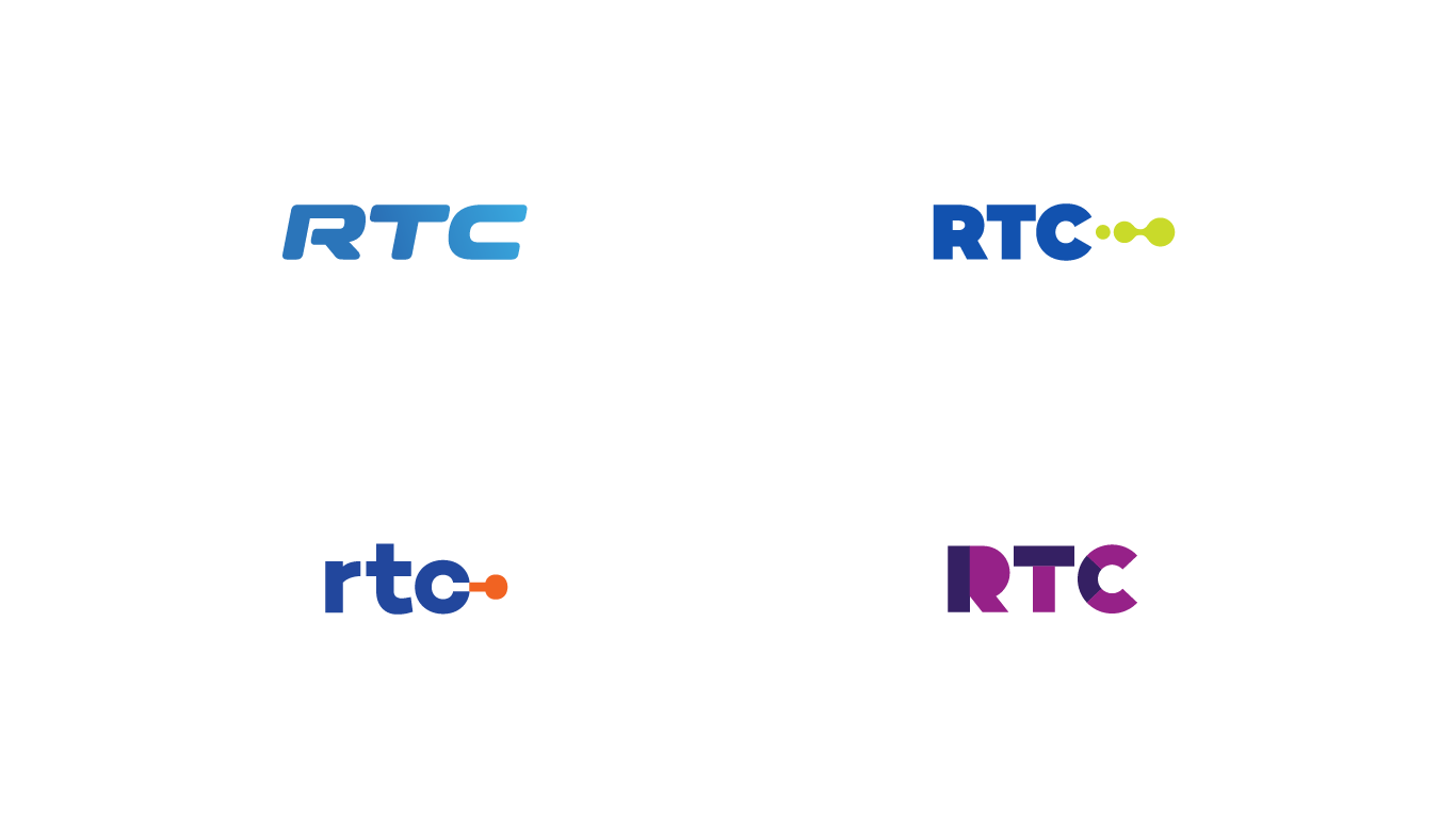
Final Logo
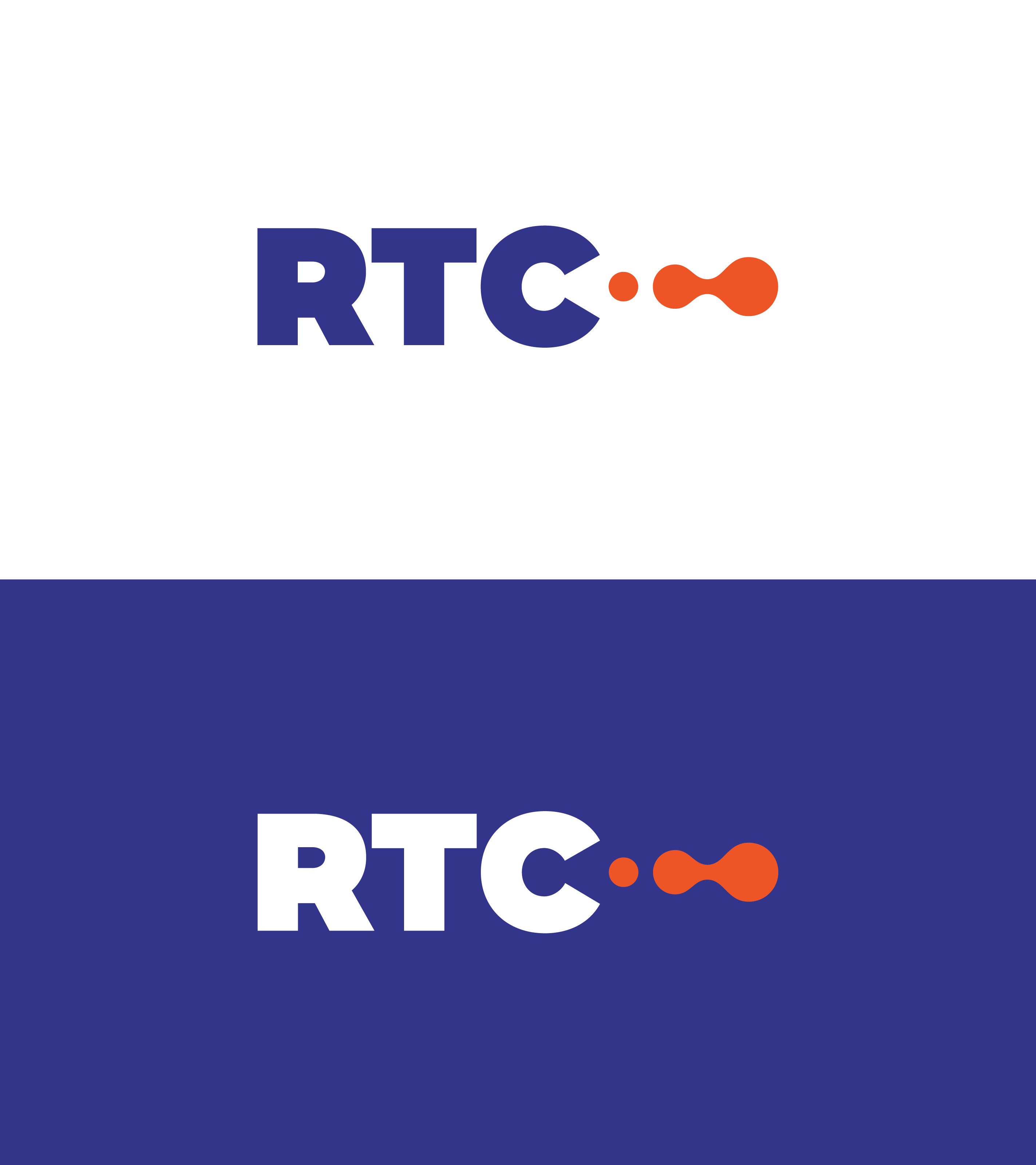
A word that kept coming up in our discovery meetings was “bold,” and that was what I wanted to deliver. The final logo is a punchy, abstract representation of the new RTC. The concept behind the design is “Connection”—both in the personal sense with their customers, as well as the internet, TV, and other services they provide. The heavyweight typeface and bright color palette give it a strong, modern look, while the logomark evokes a sense of speed, growth, and movement. RTC was so thrilled with this concept that they decided to bring it into their new corporate tagline: “Complete Connection,” which reinforced the idea that RTC could meet all of their customers’ needs.
Design System
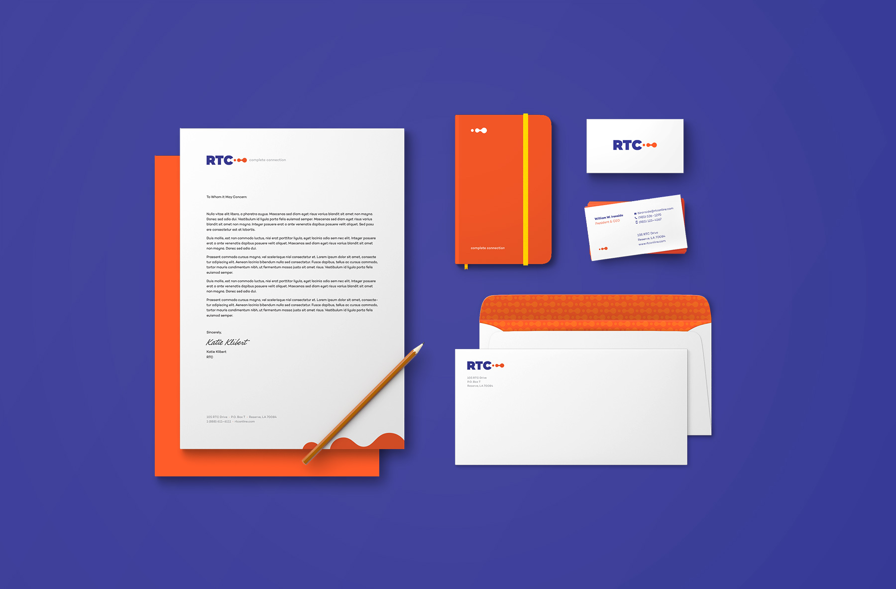
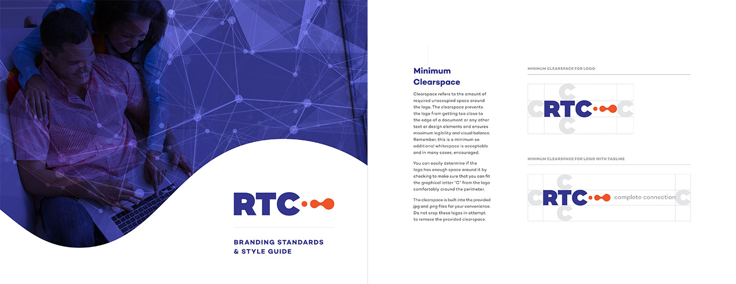
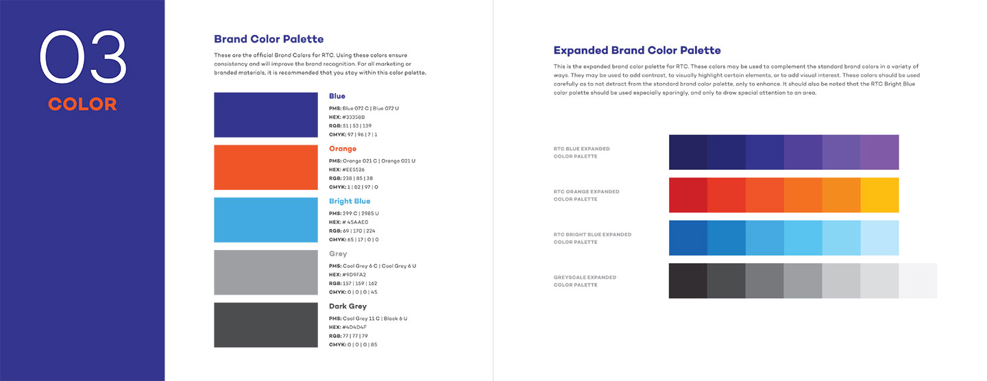
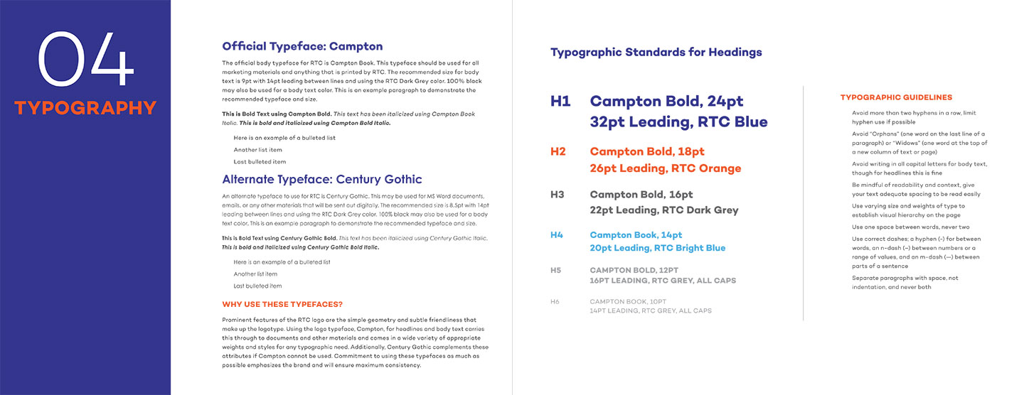
Along with the package of final logo files, I created a style guide for the client to refer to for consistent and proper application of their new brand assets. I also designed a suite of printed business collateral including a letterhead, an envelope, and business cards.
Design System
Along with the package of final logo files, I created a style guide for the client to refer to for consistent and proper application of their new brand assets. I also designed a suite of printed business collateral including a letterhead, an envelope, and business cards,
Design System
Along with the package of final logo files, I created a style guide for the client to refer to for consistent and proper application of their new brand assets. I also designed a suite of printed business collateral including a letterhead, an envelope, and business cards,
Website
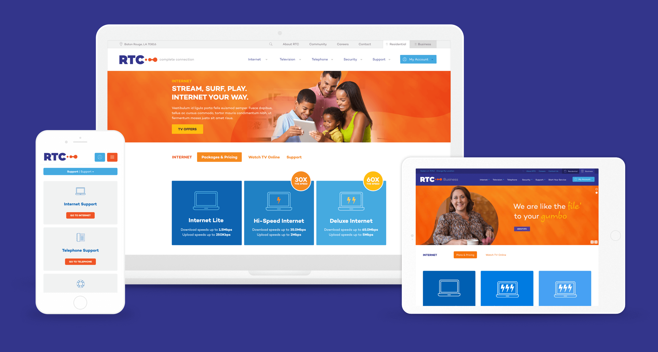
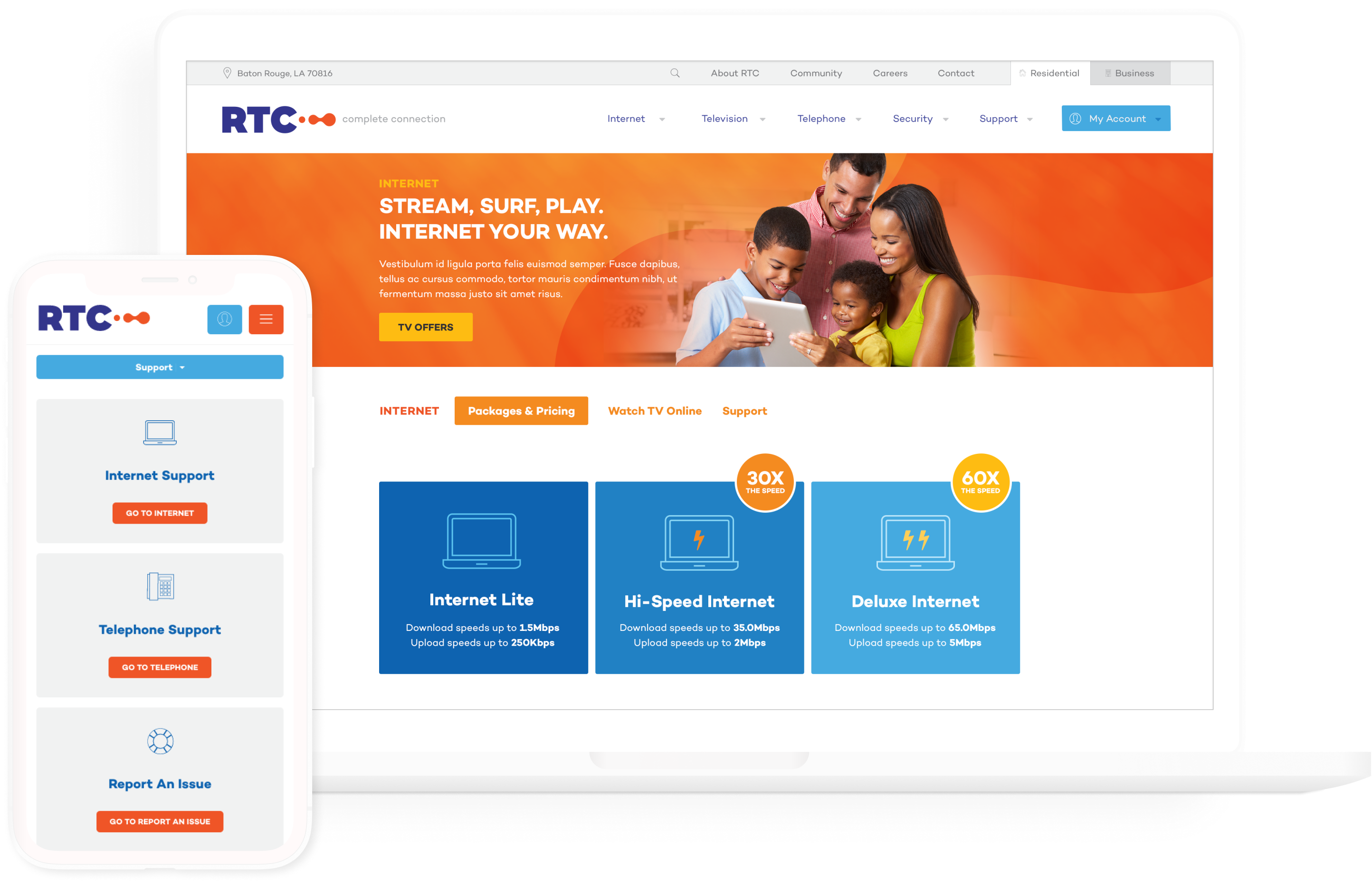
I worked with a coworker, Lynsey Gwin, to implement this new brand system into a new website. We created custom icons and eye-catching hero graphics to embellish the site, but focused mainly on an easy user experience for both business and residential customers.
Website
I worked with a coworker, Lynsey Gwin, to implement this new brand system into a new website. We created custom icons and eye-catching hero graphics to embellish the site, but focused mainly on an easy user experience for both business and residential customers.
Website
I worked with a coworker, Lynsey Gwin, to implement this new brand system into a new website. We created custom icons and eye-catching hero graphics to embellish the site, but focused mainly on an easy user experience for both business and residential customers.
